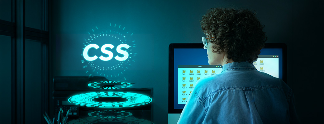
CSS Animations and CSS Transitions: How they are silently revolutionizing the user experience
Modern web design is no longer static. Many beginners often wonder what is CSS animation and how it helps create smooth, engaging interfaces without JavaScript. The web has become much more than a plain text and a flat page. Users want to today have interfaces that are alive, smooth, responsive and visually interesting.
CSS, a style language, is at the center of this change, becoming so strong that it is possible to make interfaces come alive with not a single line of JavaScript. If you are someone looking to master these skills through the CSS coding course, understanding how animations and transitions work is your first real step into professional front-end development.
Why Are Animations and Transitions Different in CSS?
Before diving deeper, it’s important to understand CSS transition basics, as they form the foundation of most simple UI interactions. It is necessary to make a clear distinction between two similar notions, which can be easily confused, before going into further details. CSS transitions are easy to use – CSS transitions specify how a property varies between one state to another within a specified time. As an illustration, when a user places the cursor over a button, and the button changes color without immediate transition, it is a transition.
Animations however, provide much more control. The developers may specify more steps of motion by using the keyframes rule and elements can be rotated, bounced, faded, or slide in and out in complex sequences without ever touching JavaScript. Both are part of what you would deeply explore in any solid best CSS course, and understanding the difference between the two is fundamental to building polished user interfaces.
CSS Transition: Anatomy of a Transition
The easiest starting point is through transitions. The main properties include transition-property, transition-duration, transition-timing-function, & transition-delay. To better understand how CSS transition works, think of it as a way to control how smoothly one state changes into another over time. They are basically written in short by most developers. Put on a button, e.g. you can command the browser to change the background color for more than 0.3 seconds with an ease-in-out curve. The outcome is minor but mighty – it makes the interface appear alive and purposeful as opposed to robotic.
It is at the timing function that actual creativity starts. Ease, linear, ease-in, ease-out and custom cubic-Bezier values provide you with an exact control of the feel of motion. A good example is a cubic-Bezier curve, which certainly allows you to create bouncy or elastic effects that otherwise would require a JavaScript animation library. When you learn CSS with a strong focus on practical outputs, you will spend considerable time understanding how timing functions shape the personality of your UI.
Production of Custom Keyframed Animations
Keyframe animations introduce a whole new dimension of expression as soon as the transitions become comfortable. You specify what the animation is named and what are the properties at various times of the timeline – between 0 percent and 100 percent. An element (say a card) can be programmed to slide in on the left and become fully visible within 0.6 seconds. The fill mode is used to make sure that the element remains in its last position after the animation process is finished instead of returning to its initial position.
You can be even more imaginative with several keyframe stops – to achieve a subdued pulse effect that raises and falls an element up and down and up and down several times. It is especially helpful when it comes to highlighting such significant UI items as call-to-action buttons or notification icons.
Best Practices of Performance of Smoothing Animations
This is where, unfortunately most beginners usually go awry: they are animating the properties that cause the browser layout to recalculate. Animating width, height, margin, or positional values triggers what developers term layout reflow: the browser has to re-calculate all the positions of every element on the page, which is costly on the rendering performance side.
To animate the transform and the opacity is the golden rule and should be done where possible. These properties are fully processed by the GPU, and never cause layout or paint, hence are smooth even on inexpensive devices. Another trick is the will-change property of elements you intend to animate – this indicates to the web browser that further enhances performance by suggesting the element to the compositor layer at an earlier stage. Today, many developers also use AI-powered tools to generate CSS animations and suggest smoother transitions, making the design process faster while still relying on strong fundamentals of CSS.
At institutes offering IT courses with certification in Vadodara, hands-on performance optimization is increasingly becoming a core part of the curriculum because knowing how to animate is only half the job. It is knowledge on how to do it best that is the difference between amateurs and professionals.
Profane Applications That Transcend Aesthetics
CSS animations are easy to regard only as decoration, yet they can be utilized in real-life functional needs with reasonable purposes. Skeleton screens and spinner animations are employed by loading states to make sure that the user does not think that an application is broken when loading data. Micro-interactions give small feedback cues, a checkbox bouncing into focus or a form field trembling with invalid input indicating system health without having to rely on textual feedback. Fading or sliding page transitions between sections assist users to have spatial cognition in single-page applications.
The most effective UI designers use animation as an element of communication not as a decoration. Each movement must have a goal – to direct the attention, validate the actions, or to convey the relationships between the elements.
The Reasons Why Learning CSS Animations Is A Career-Defining Skill
The use of animation skills is becoming a distinguishable requirement in the job description of front-end development jobs. Although frameworks and animation libraries are trending, they all are based on the same CSS foundations. An artist with proper knowledge of keyframes, timing functions and properties that can be composited by the GPU will always be ahead of the others, since he/she knows how to debug, optimize and even extend any animation system with a sense of confidence.
To Gujarat learners seeking to get trained in CSS in a structured and industry-oriented training, Vtech Labs provides CSS training where you are trained in the basics and then up to advanced animation techniques used in real life projects. Emphasis is made on creation of things – this is what makes animation skill stick.
CSS animation is among the most satisfying front-end skills to your toolset whether you are experimenting with your first transition or building intricate multi-step keyframe animation. It is accurate, imaginative and -when correctly executed-invisible. The most effective animations are the ones that users do not even touch and feel.
Conclusion
CSS transitions and animations are no longer a luxury feature but are projected to be part of the new generation of interfaces. Hover effects to loading states, capacity to animate UI elements with clean and high performance. So, by Enrolling in proper structured training having real project work would be the fastest path to mastering this craft.
back to blog